Hate to break it to you, but I've recently discovered that Tumblr is about a floppitygillion times better than Blogger (no offense). So...you can find my new posts here. It's so easy that it's addicting. Plus I think it looks nicer.
Monday, November 22, 2010
Monday, November 15, 2010
Knock Me Out
As a result of annotated bibliographies, I would like to be knocked unconscious right now. And if someone were to hit me in the brain while wearing any of these beauties, that would probably do the trick. And as long as they left the rings for me when I come-to, I wouldn't even be mad.
| By Erica Anenberg |
 |
| Erica Anenberg |
 |
| Why yes, that IS a door knocker By Pat Kim Designs |
Saturday, November 13, 2010
Blog Fever
Sometimes you're just in the blogging mood, I guess. I personally believe this is brought on by having an English assignment that I do NOT care to do (annotated bibliography, anyone?), and therefore wasting my time by creeping around the internet, which leads me to finding awesome things which I am then basically obligated to post here.
1/ More Infographics
Ever since I was forced to flex my math-brain muscles with an infographic assignment, I've been ever-so-slightly obsessed with them.
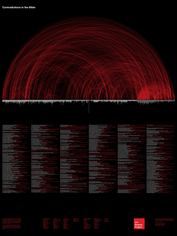
This one, a look at discrepancies in the Bible, is pretty neat. Commissioned by Project Reason, via The Fast Company and I Love Charts
This lead me to look further into I Love Charts, where I found this lil gem, a chart of human sexuality/activity.

In related news, you may have noticed that this blog is run on Google's Blogspot. I Love Charts, however, is run on Tumblr (as are many other blogs I'm a fan of) and I wanted to follow them so I decided to just go ahead and create a Tumblr account...so there may be a change coming in the future. This might have to wait until I can take the time to code it myself (to impress any future employers who may be reading it) which really could take years.
Going forward...
2/ Harry Potter Weekend
Because I'm a giant weirdo, I watch Harry Potter whenever it's on TV (also almost any time it's gloomy, aka harry potter weather, and sometimes I listen to the books on CD for no reason at all) and this weekend happens to be one of ABC Families frequent "Harry Potter Weekends." So obviously I'm watching some HP this morning, and Neville Longbottom comes on my tv screen to introduce a clip and turns out lil Neville (real name Matt Lewis) is a smokin hottie. See bellow.
 |
| via the New York Post |
I would NOT kick that out of my bed. Call me!
3/ Things I found awhile ago and forgot to post (oops)
3.1/ Scarf-y collar things
 |
| by Symmetry |
3.2/ Adorable Dishware
 |
| by Lenneke Wispelwey of The Netherlands |
 |
| still Lenneke Wispelwey |
3.3/ Le Petit Petit


Just Look
Since my last post was pretty word-intensive, I've decided to try to balance it out with one full of pictures of things I've liked recently.
Enjoy!
Boots and (well-dressed) Babies


Fur-Collar Coats


Plaid Shoulder Bag
also at Urban Outfitters

Canadian Animals


Beer and Hotdogs
on The Dieline


Something Swedish
on this blog


I think it's safe to say I have little to no idea what's going on here (all I can really make out is design, trend, and Swedish Ninja). But as you can tell from the close-up, an adorable Swedish man is involved (feel free to learn fluent English and call me up!)
Monday, November 8, 2010
Look What I'm Doing With My Life
So, I usually like to at least TRY to have some semblance of a theme for my posts, but as it was pointed out to me today (AHEM, Sydney Steininger and Christine Tabb) that I haven't posted since the beginning of October, I'm just going to have to forfeit a coherent theme and go with one that will make little to no sense...What I'm Doing with My Life or Things I Consider 'Work'.
Confused? Deal with it, keep reading.
Maybe some of you don't know (because you are random people reading this for only-God-knows-why and not people I have actually met. Not that you should stop reading. Please, I need all the followers I can get.) but I'm taking a class in relief printmaking class this semester and well, it's basically awesome. Here are some of my projects
Project 1: Spoon Printing
This beast was hand printed. With my delicate lady hands and a wooden spoon of all things. This was tough, and I sucked at it. Here's the best I could come up with.
 |
What is that? A girl. A girl with hair. Why? Who knows. Don't worry though, I sucked less the next time around. |
Project 2: Color Reduction
Inspired by my father, Tommy Hilfiger, and reindeer sweaters:
 |
Top left, my finished print; top right, reindeer sweater for your reference; and bottom, The Hilfigers
Project 3 did not go so well, so I'm not going to embarrass myself all over the internet by showing you. Going forward...
Project 4: More Color Reduction
Still in the development phase, but these are some of my inspiration/reference images. Sketches and final print, coming soon to a screen near you! (I mean, unless it turns out to be a real junker)

This dashing, mustachioed man is Charles Rennie Mackintosh, the architect who designed the Glasgow School of Art (which I visited when I used to be an awesome international student). On the bottom right is a wall at CBS designed by Lou Dorfsman, it's called Gastrotypographicalassemblage and I like it
What's that? Shut up and post some pretty images?
Well fine, look at this junk:
 |
| Infographic for oil spills. |
I'm not going to lie to you fine folk, this project was pretty terrible to work on and I'm oh-so-glad it is over.
If you're interested, the map shows the location and magnitude of the 20 worst oil spills since 1989 when the Exxon Valdez crashed (into an iceberg or something, I've heard the driver was drunk but who really knows). Those nice little triangles point out the location and are sized to represent the number of gallons of oil spilled. They are also color-coded by the cause of the accident. Those numbers are also represented to the right of the map in a bar graph, which then compares the total amount spilled in twenty-one years to the amount the world consumes IN ONE SINGLE DAY. Also, that circle below the bars compares the amount of oil spilled in the Deepwater Horizon incident with how much one supertanker can hold. And FINALLY, on the far right is a diagram of a car and some numbers indicating how much oil it takes to make commonly found things on/in cars (gasoline or diesel fuel, tires, the polystyrene cups you might drink soda or coffee out of, and asphalt)
SEE, wouldn't you rather just LOOK at that chart than read that whole paragraph explaining it?! Infographics are dead useful, but I am probably not the one who should be making them.
Unless you are an employer looking to hire me to make an infographic. Then, I'M THE GIRL FOR YOU!
I didn't make these, but I thought maybe you would want to look at some quality infographics, so here are some that I especially like:


Subscribe to:
Posts (Atom)